Case study
MIT Registrar’s Office
Client: MIT Office of the Registrar
Services: user discovery, RFP and project management
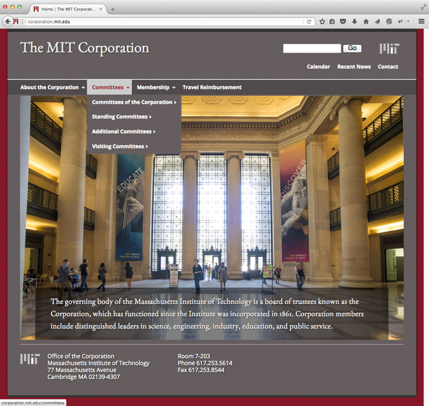
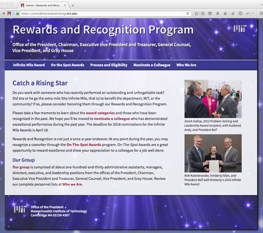
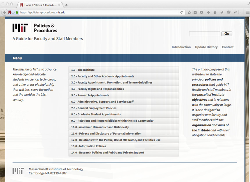
The MIT Registrar’s Office has taken over many business processes and content areas since their last website redesign in 2005. Without an overall communication plan, adjunct sites with their own branding proliferated, creating a usability challenge for the students, faculty advisors, academic administrators, and registrar staff who rely on the site for vital academic business fucntions.
The Registrar’s Office had no site analytics and no information on what their users were experiencing. To begin assessing how the site would be redesigned and rebuilt, I carried out a series of interviews with a wide range of selected site users to discover what they needed from the site. The valuable information gleaned from these one-on-one fact finding sessions was summarized in a report that recommended engaging a UX/IA specialist, a content strategist, and a visual designer to work together as a team to define the specifications for the new site that could then be sent out for estimates.
Working with some of the best Boston-area practitioners in web discipline and the six-person client team, a site structure and visual design took shape through a lengthy process of site user defintions and profiles, personas, card-sorting, site mapping, and content assessment, validated through online testing and accessibility reviews. Upon completion of this phase, another RFP was sent out for development bids.
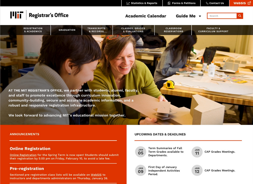
The new Registrar’s site launched in August 2018.
UX/IA strategist: Debby Levinson; content strategist: Thurston Lighty; visual design: Stoltze Design; developer: Pod Consulting.
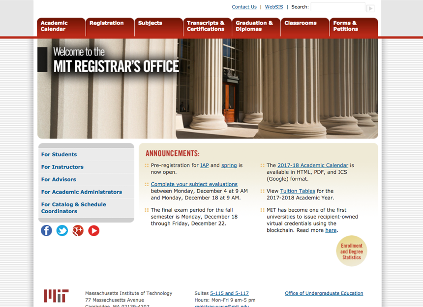 Old site
 Mobile view